Click on the images below to view larger versions


Client: Valley Press
Project: Test covers for a collection of short stories
FINAL DESIGNS
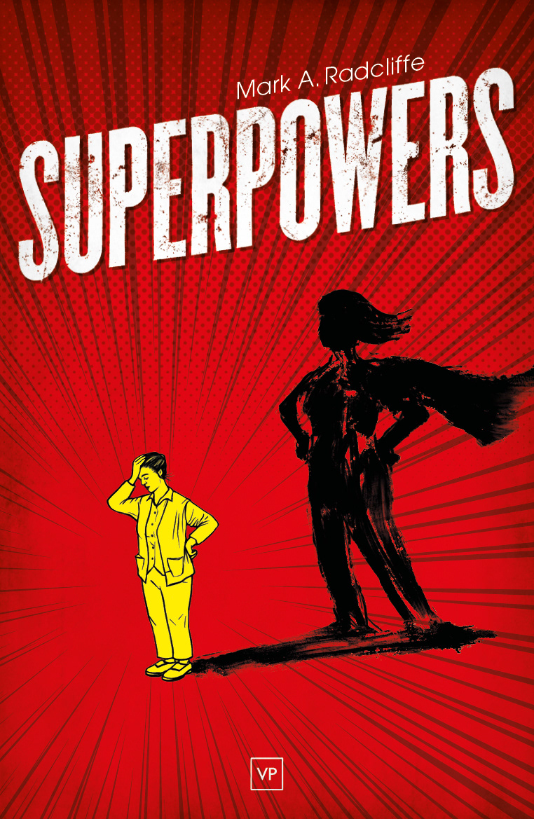
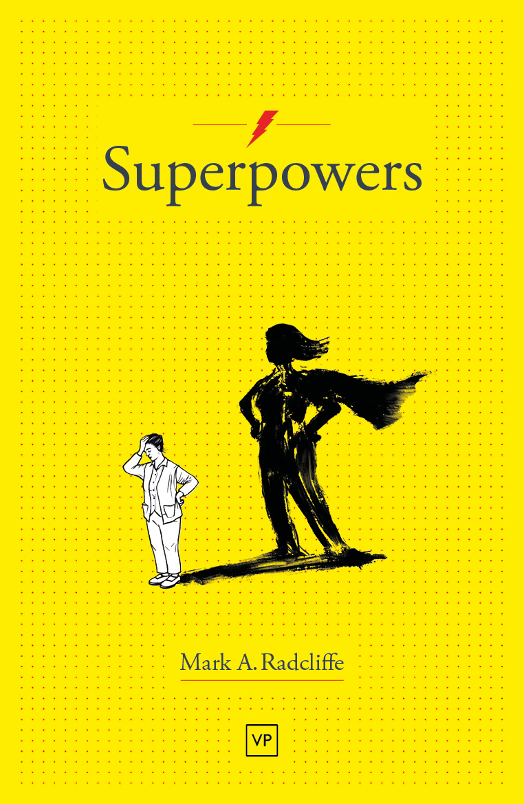
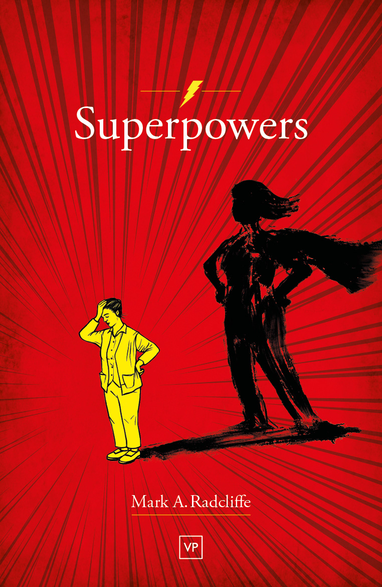
Using a supplied line illustration, the covers needed to employ the design language of comics and superheroes without dominating the final look. This was achieved by the subtle incorporation of half-tones, action lines, dynamic type and superhero symbolism whilst ensuring it still presented itself as a book rather than a graphic novel.
The main colours to be used had to be red and yellow.