Click on the images below to view larger versions


Client: Shadowacre Ltd
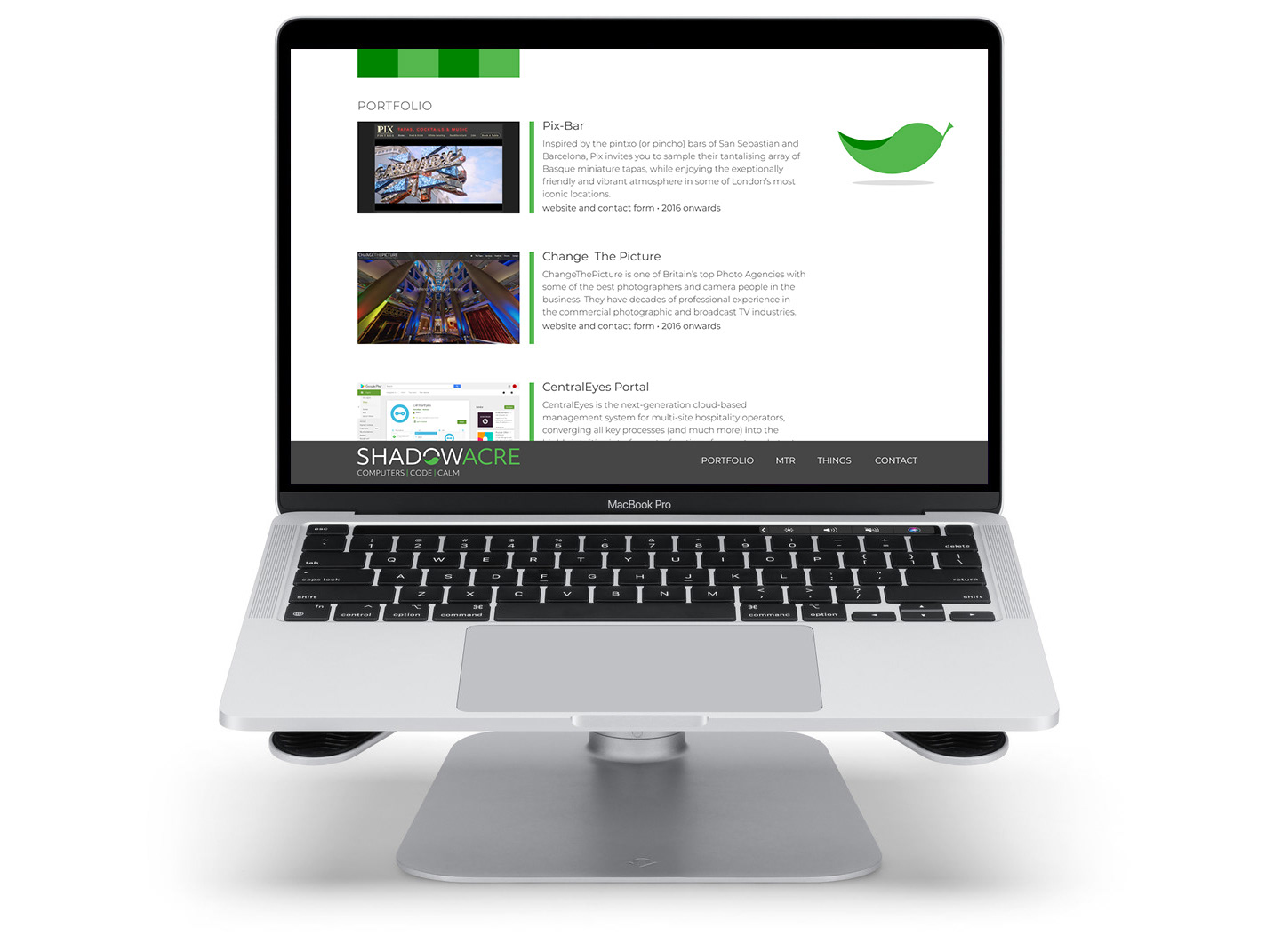
Project: Brand Design for Digital Development and Management Company
OVERVIEW
The client aimed to convey a sense of calm and stress-free solutions. To reflect this, a single leaf was chosen as a central symbol, representing a small yet vital part of a larger, harmonious system.
This motif was seamlessly integrated into the logotype, drawing inspiration from the yin-yang symbol to emphasise the company’s core values of balance and interconnectedness.
To support the brand’s versatility across different applications, two distinct colour palettes were developed: a calming green and a warm orange. These colours work together to evoke feelings of tranquility and equilibrium, aligning with the overall brand message.