Click on the images below to view larger versions
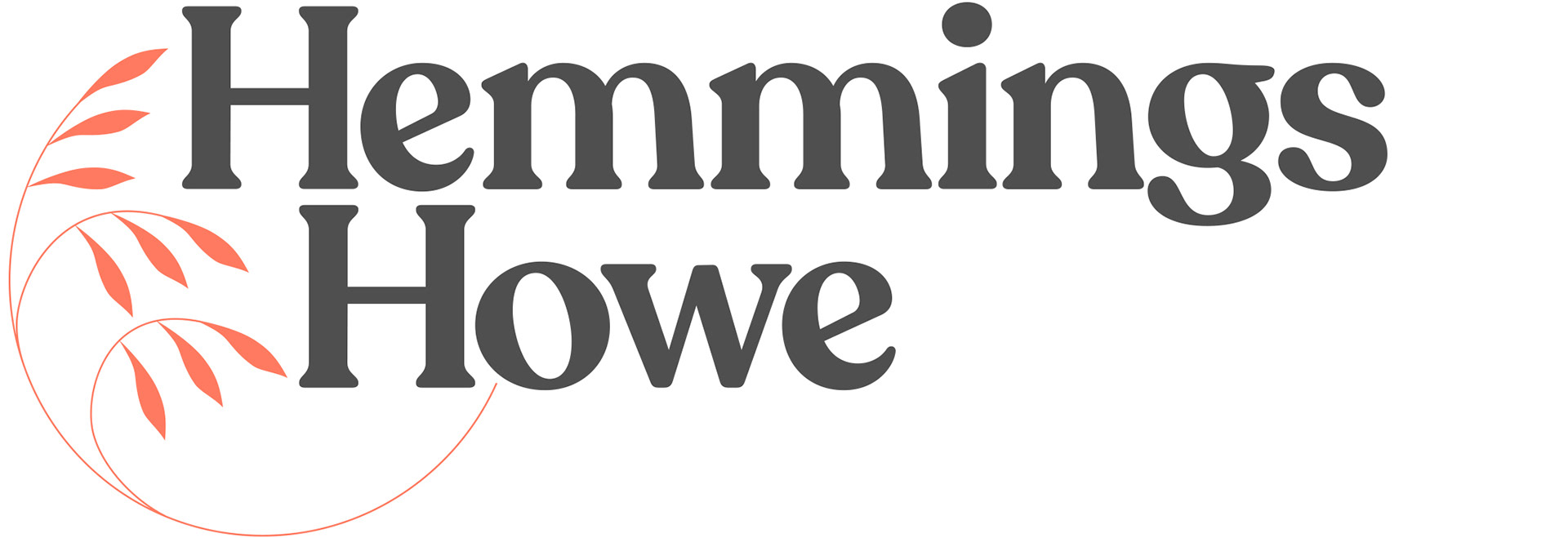


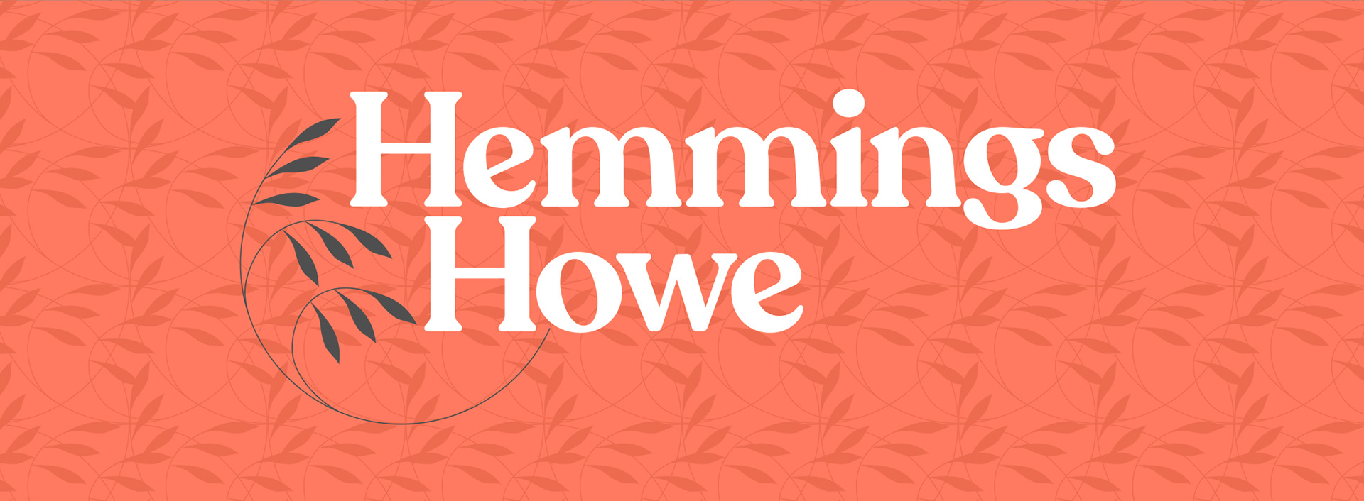
Client: Seam Studios / Hemmings Howe Associates Limited
Project: Logotype / brand development
FINAL DESIGN
Hemmings Howe are specialists in mis-sold pension compensation claims with a leaning towards helping senior citizen whilst teaching them to use technology around the financial sector in a safe and secure way.
The company wanted to present itself as both approachable and traditional.
The brief asked for a brand development that included the main logo, monogram, background pattern and colour palette.
Possibilities around a laurel leaf motif were explored. This had to work in isolation, combined with the logotypes and as a background pattern.
The typeface Recoleta Semi Bold was settled upon for its gentle form.
For the colour palette, charcoal was selected alongside a softer, muted orange for contrast.