Click on the images below to view larger versions


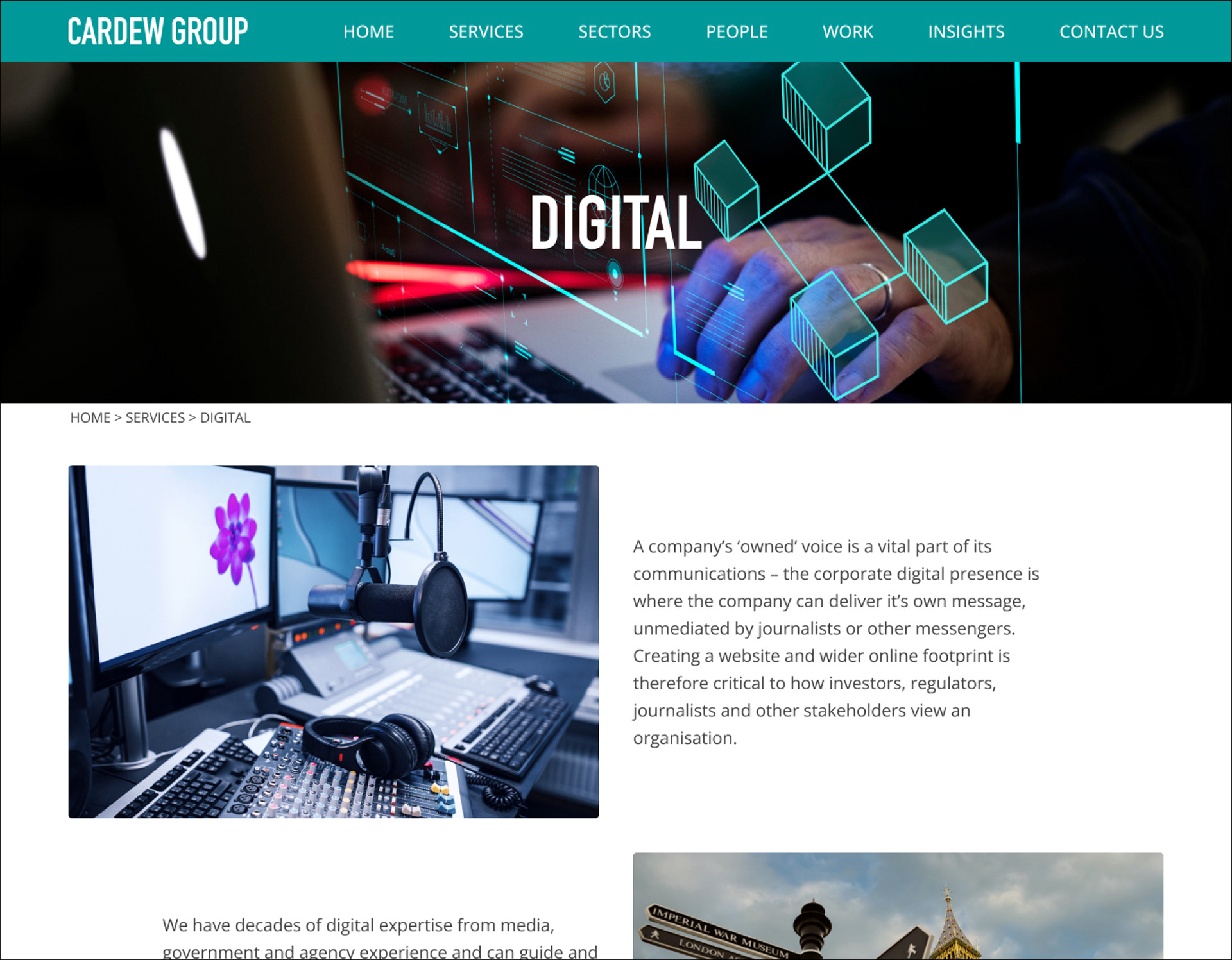
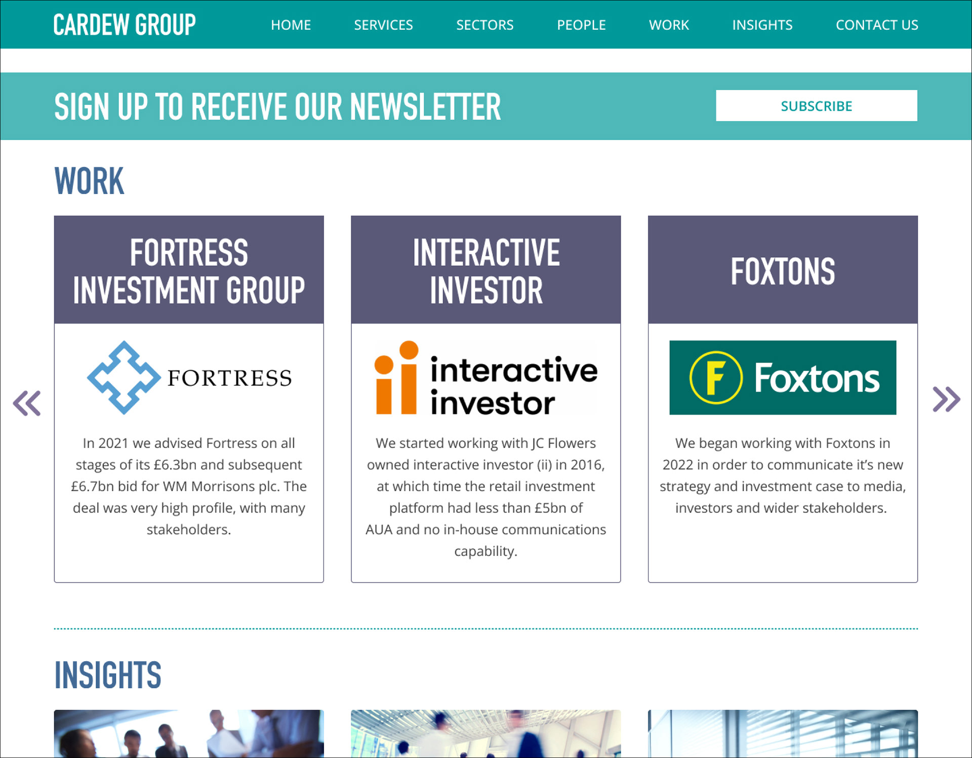
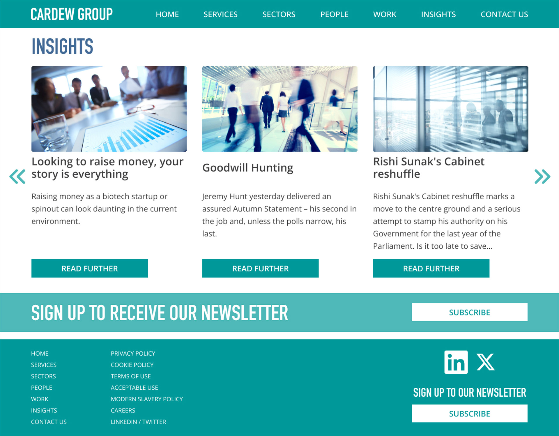
Client: Cardew Group (Threekey)
Project: Logo and website development for business communications group
FINAL DESIGN
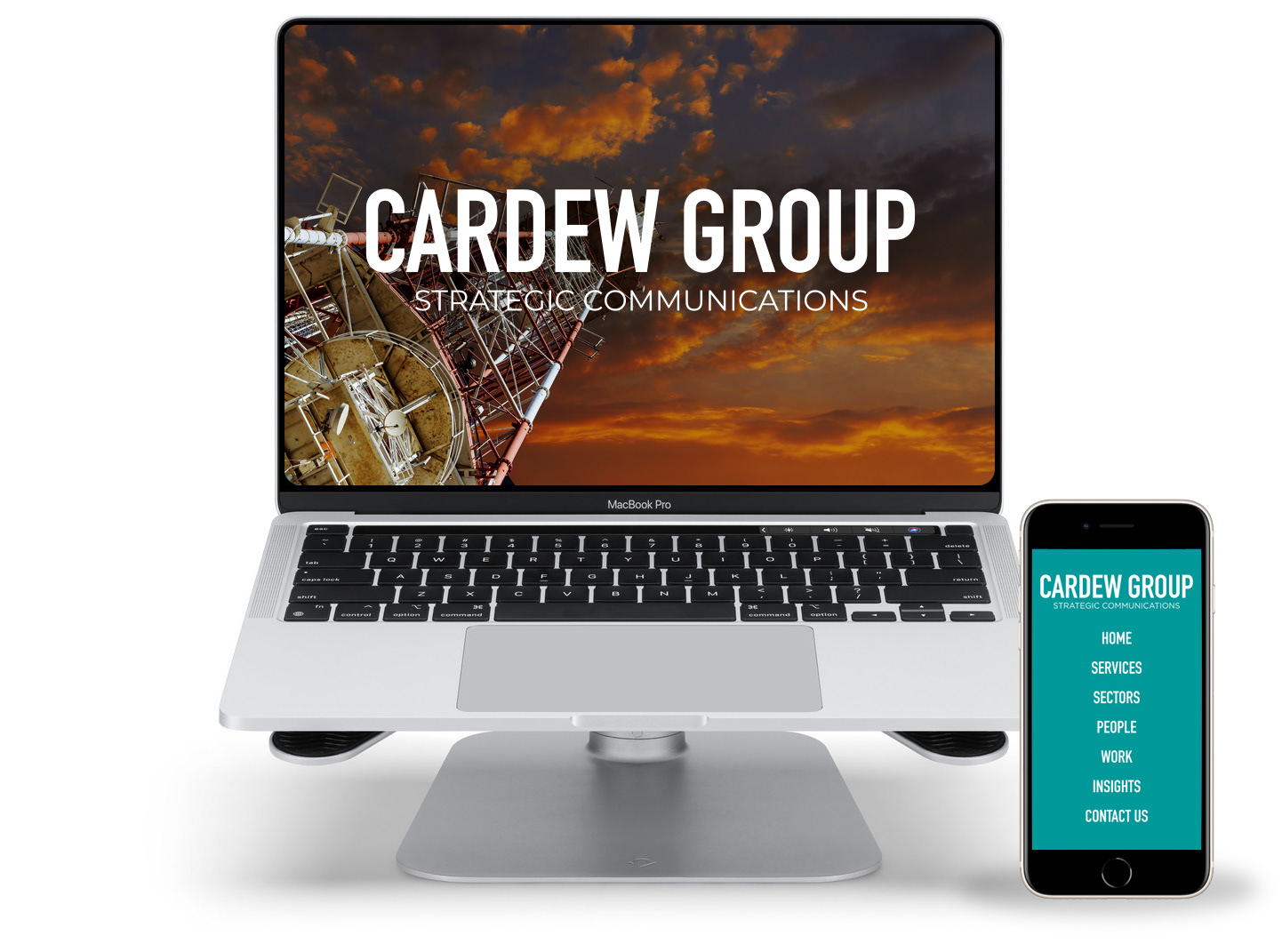
The brief was to develop a Logo, colour palette and website design for a business communications company.
The Logo had to utilise the the same fonts as used for the parent company TB Cardew.
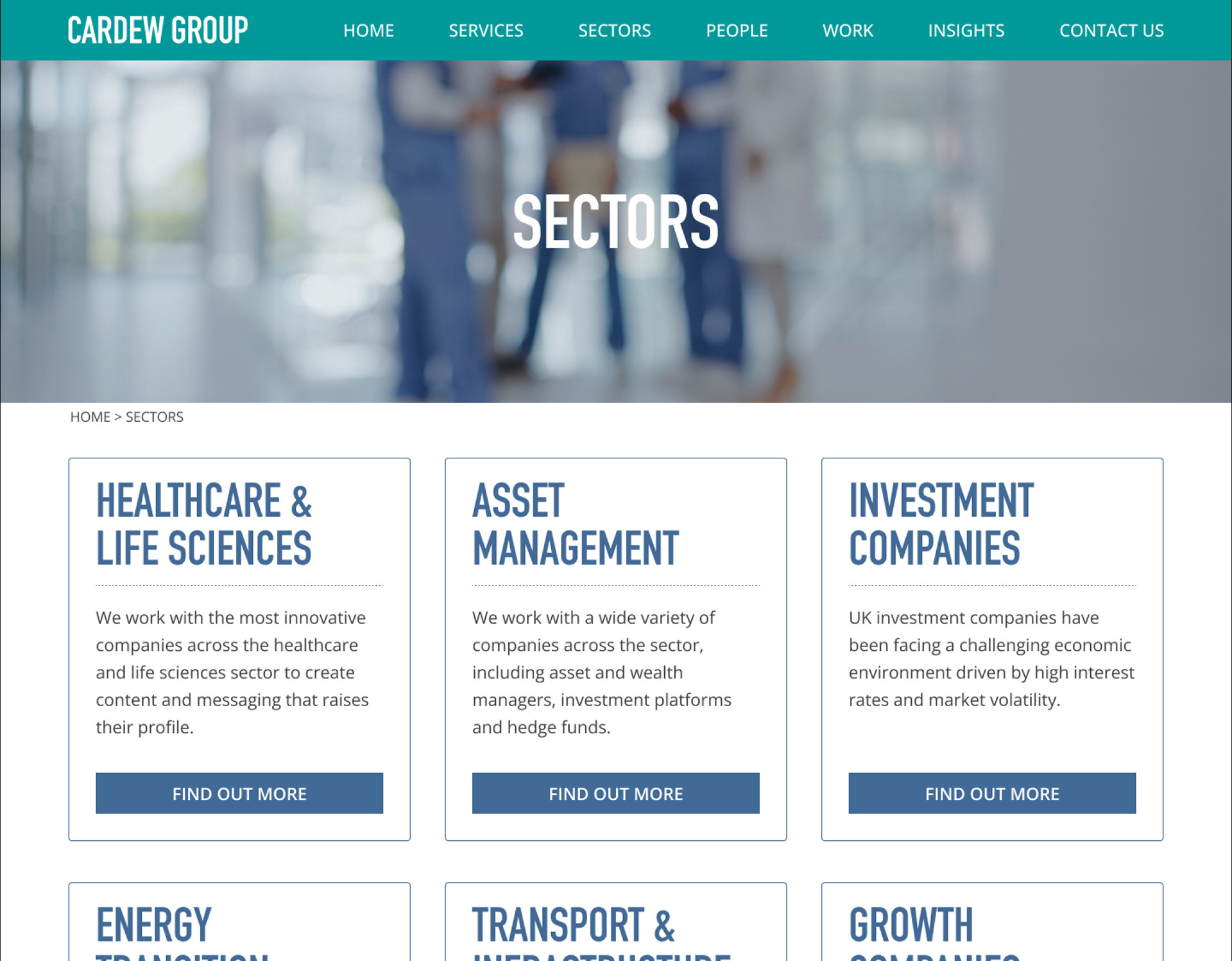
The existing colour palette only used teal and it was felt that this needed expanding to a dark blue and dark purple to help give identity to their different areas of business.
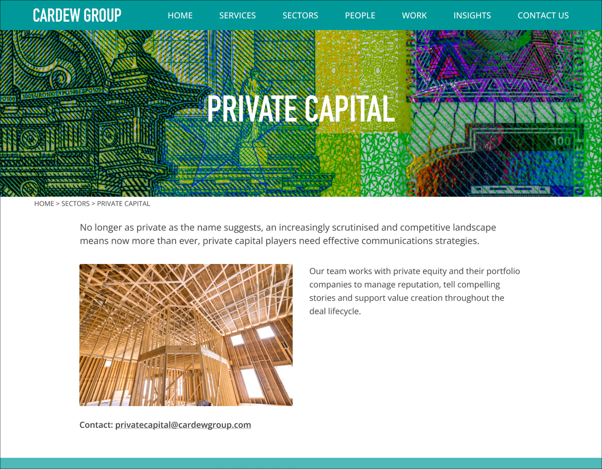
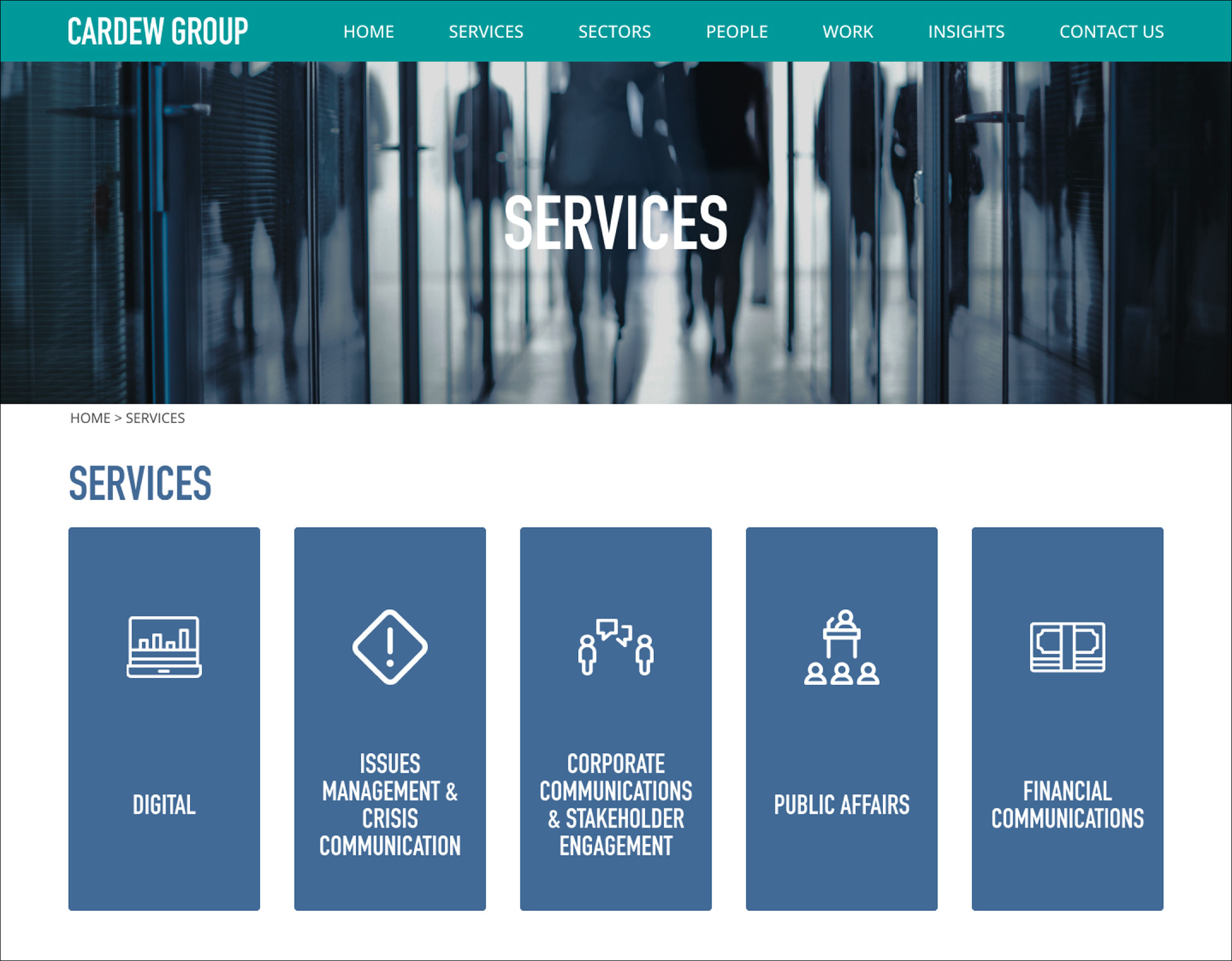
The site had to reflect the authority and experience of Cardew Group whilst presenting a clean, contemporary layout.
The website was designed in such a way that the developer could utilise the “Apostrophe” content management system. This required designing re-usable elements in the form of cards or widgets.