Click on the images below to view larger versions

Client: Cardew Group (Threekey)
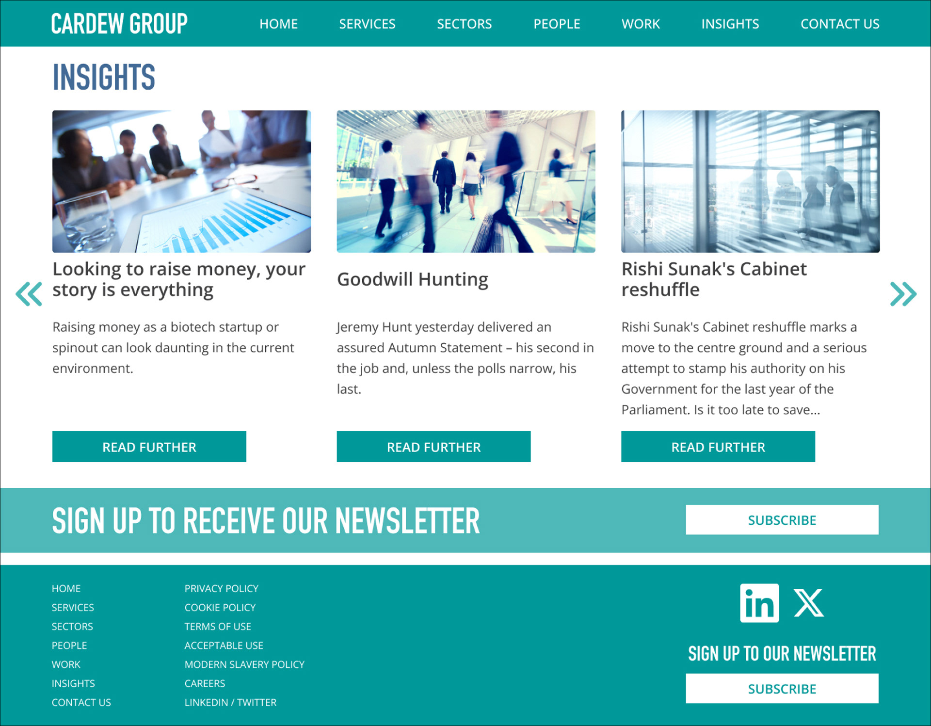
Project: Brand Identity and Website Development for a Business Communications Group
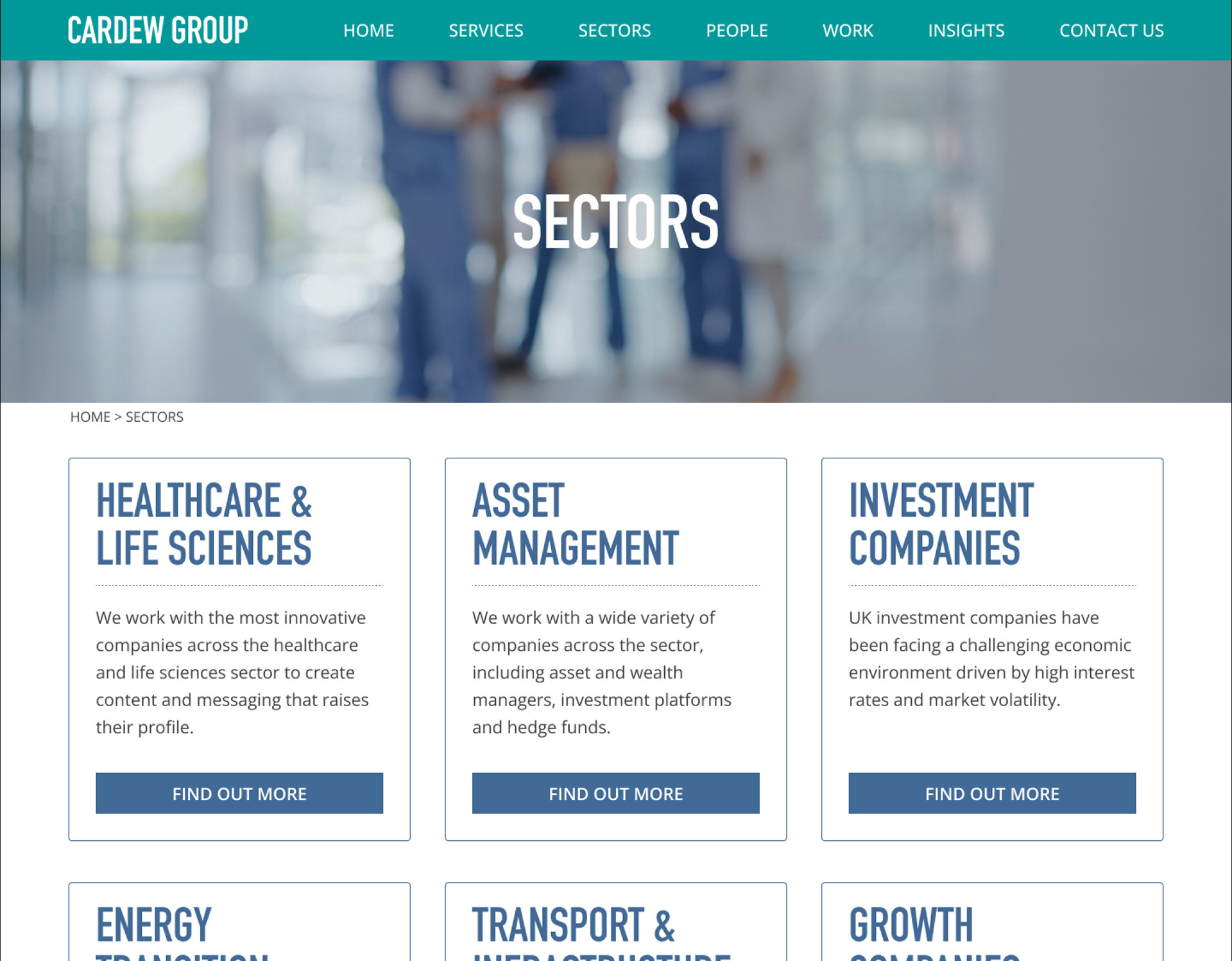
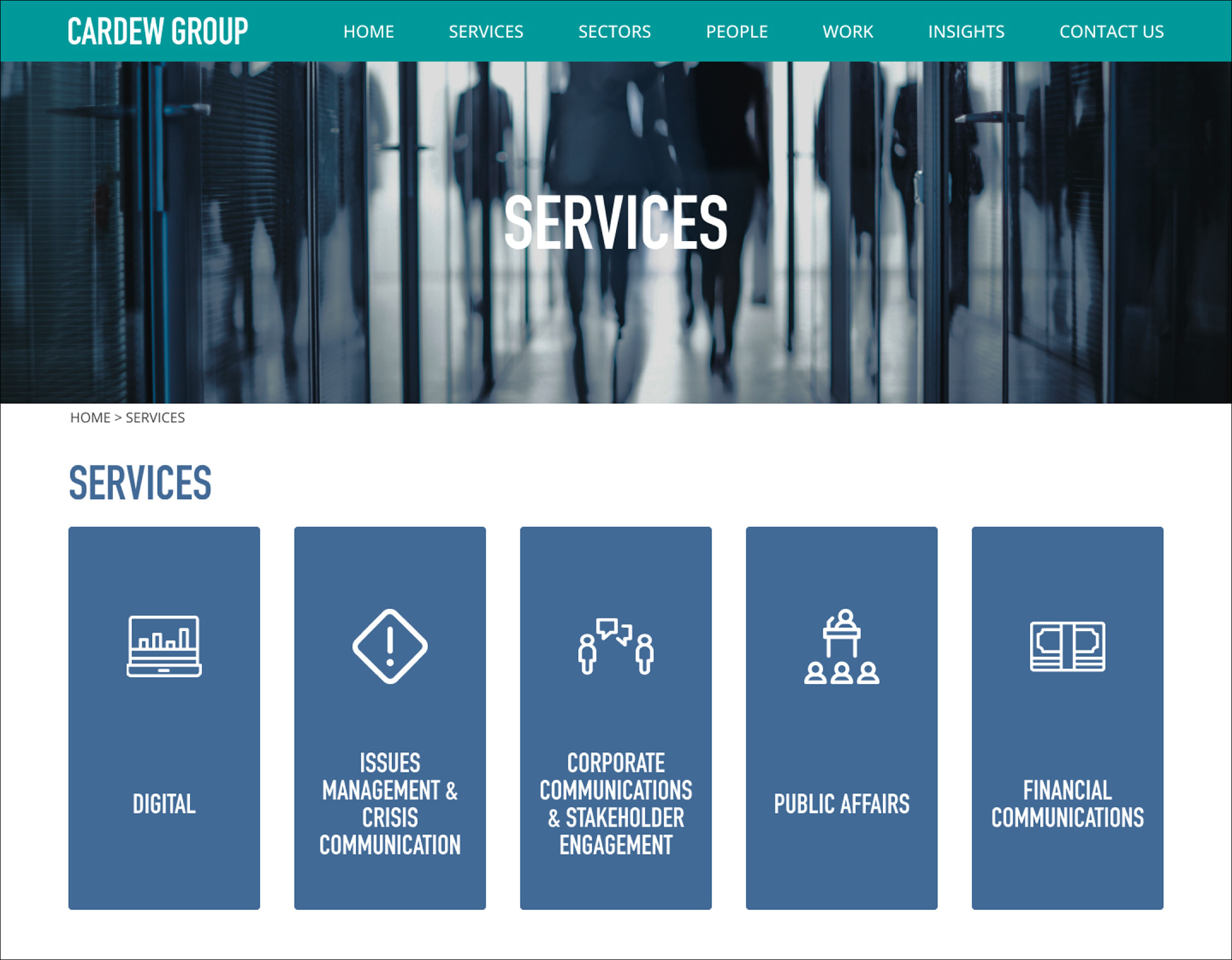
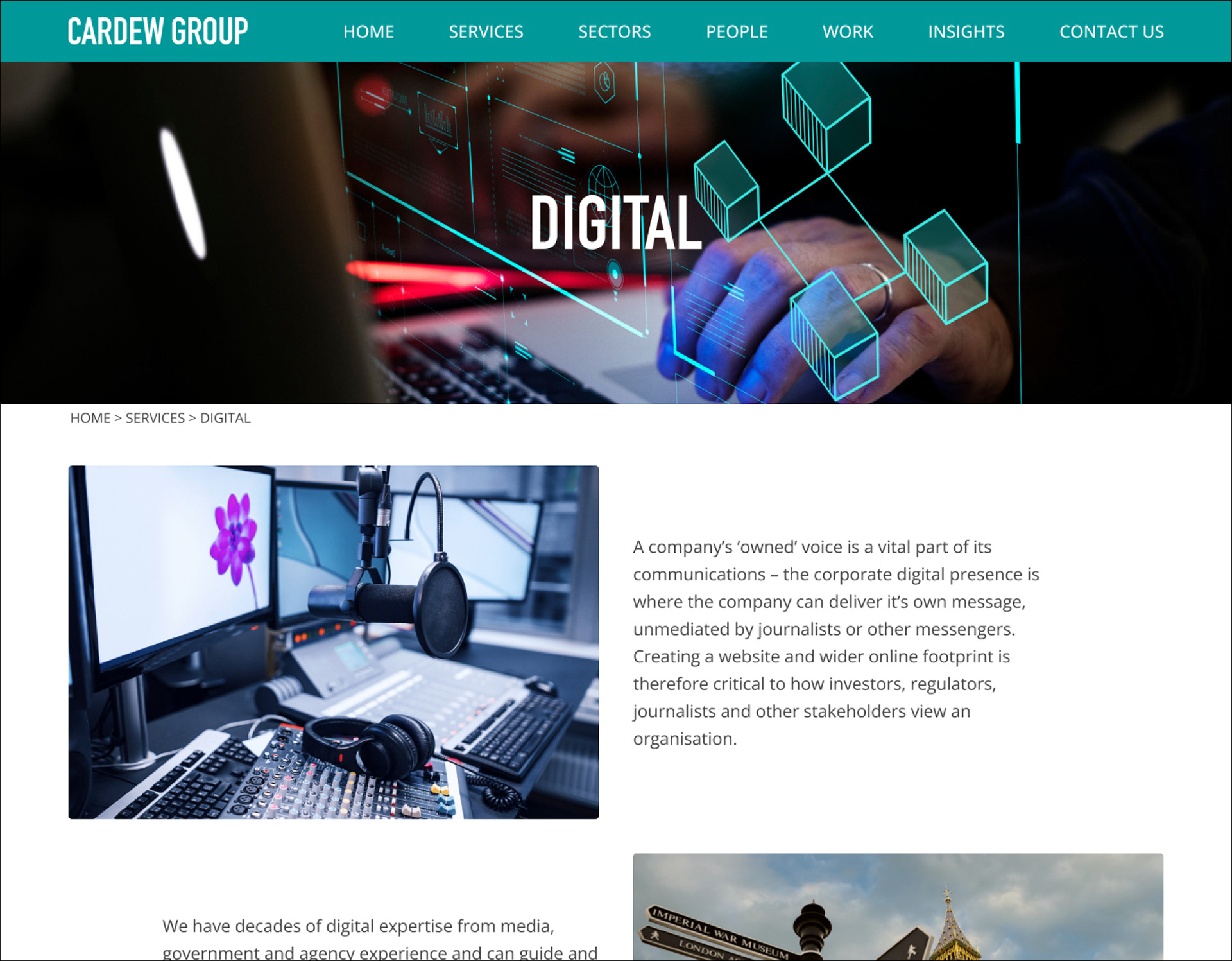
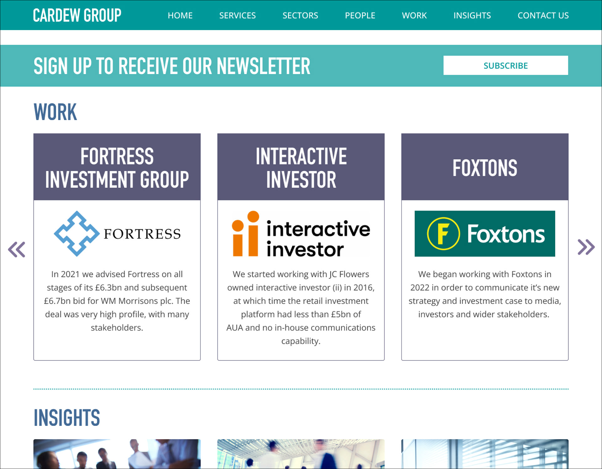
OVERVIEW
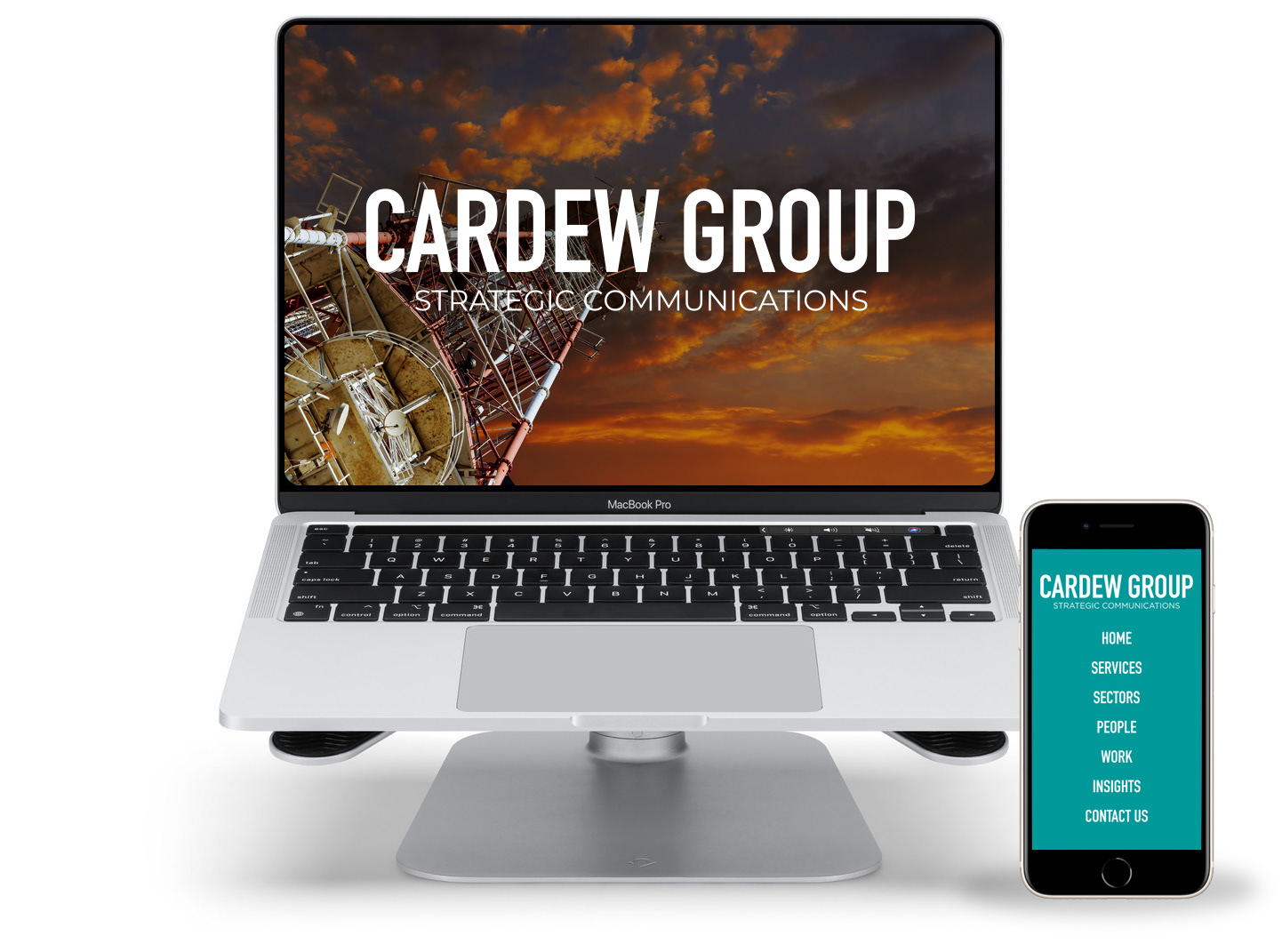
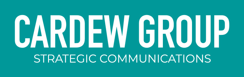
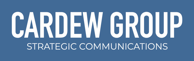
The project involved creating a cohesive brand identity and website design for a business communications company within the Cardew Group. The logo was developed to align with the parent company, TB Cardew, by using the same fonts to ensure brand consistency.
The original colour palette, which only featured teal, was expanded to include deep navy blue and rich dark purple. This added depth and helped to distinguish the company’s different business areas, giving each a unique identity while maintaining overall harmony.
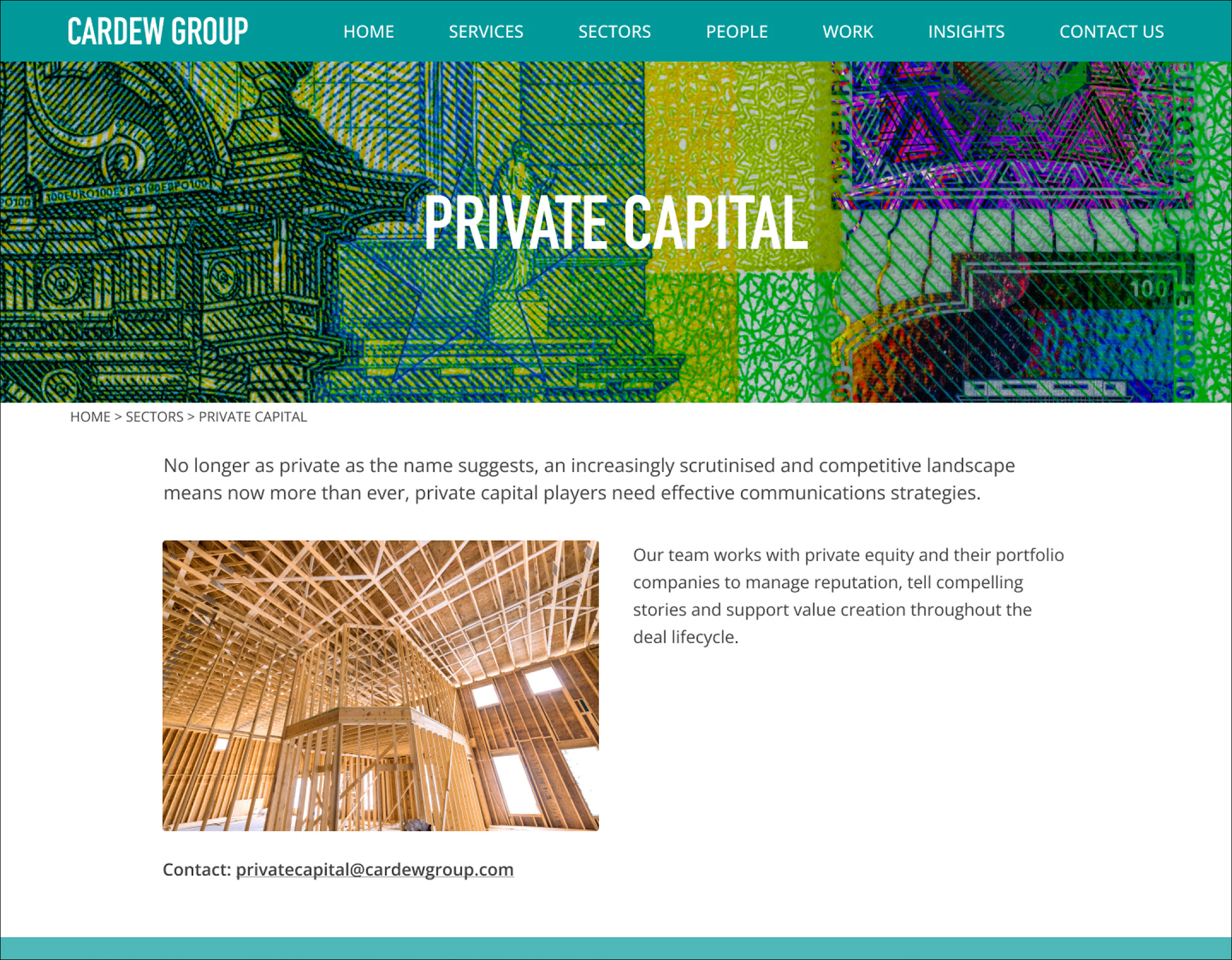
The website was designed with a clean, contemporary layout that reflects the authority and expertise of the Cardew Group. The design emphasises clarity and professionalism, creating an intuitive user experience.
To support easy content management, the design incorporated flexible, reusable elements such as cards and widgets. This approach enabled seamless integration with the Apostrophe CMS and facilitated efficient updates by the development team.