Click on the images below to view larger versions





Client: Eaglemoss (Eon Productions)
Project: Development for magazine collection
FINAL DESIGNS
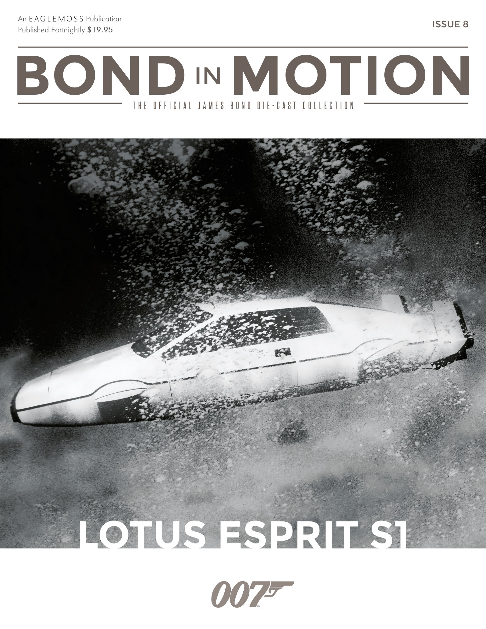
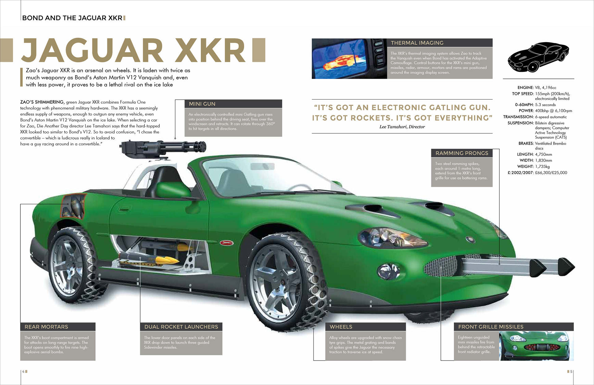
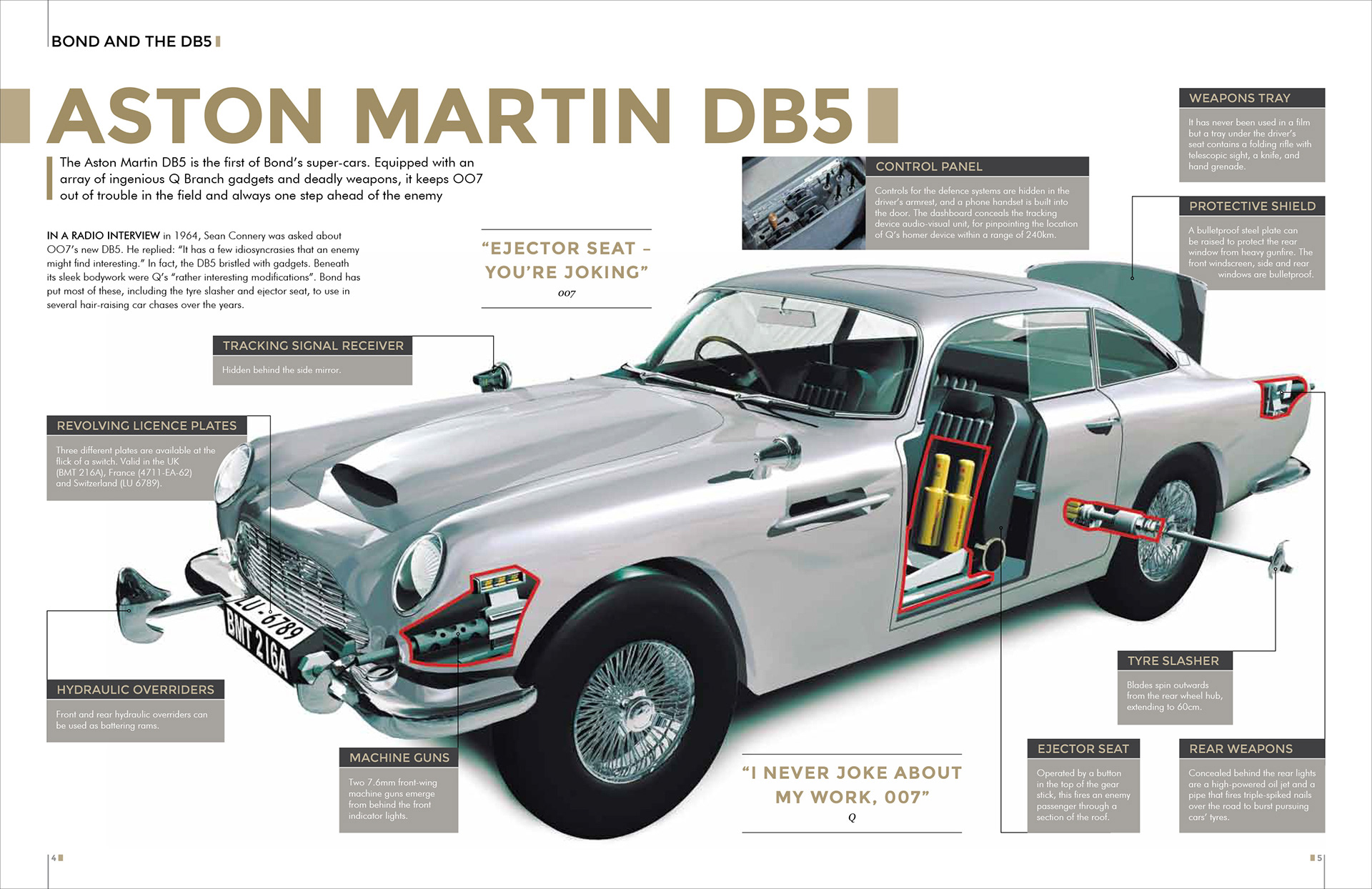
I was required develop a magazine which would work in conjunction with both the Eaglemoss James Bond model car collection and the Bond In Motion exhibition.
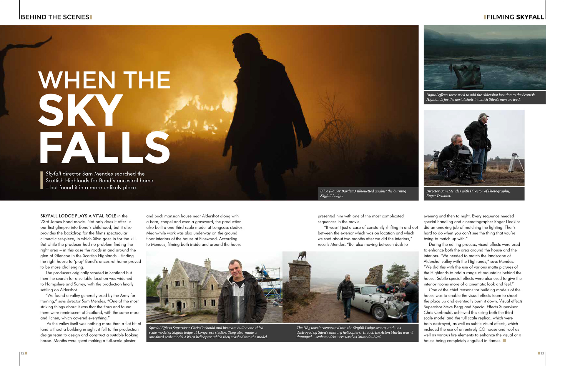
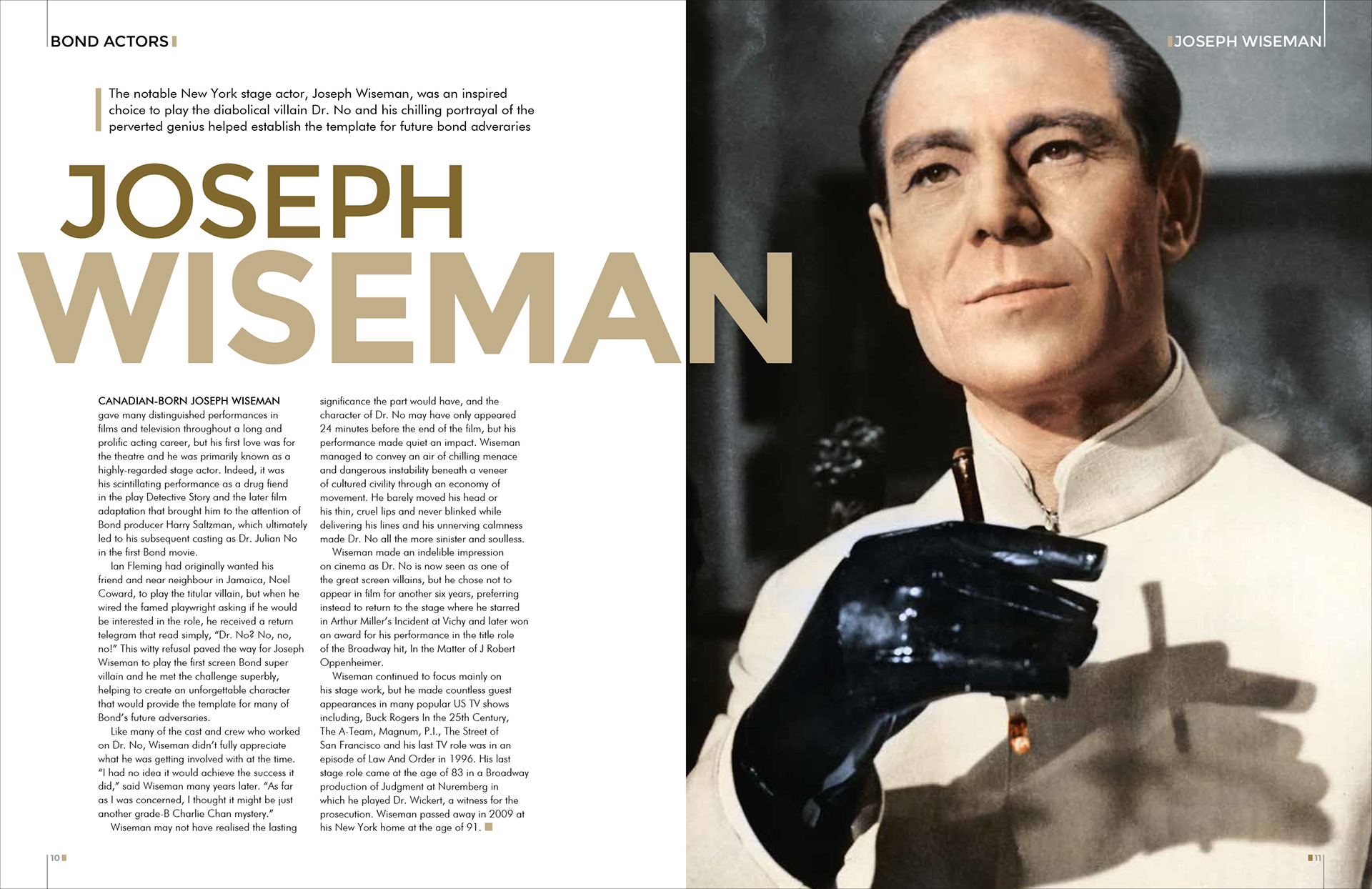
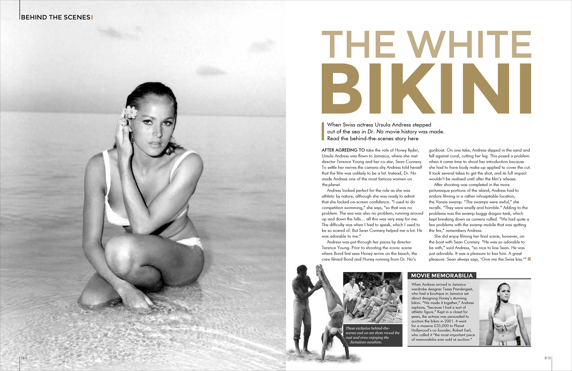
A strong typographic approach was needed to reflect both the current Bond film style and also that of the exhibition.
A simple two colour palette was used throughout keeping in line with the Bond In Motion exhibition branding.
The magazine also needed to give focus to the vast collection of high quality photography that had been accumulated over the years. For this, full page images were used wherever possible. The simple colour palette helped with the older black and white images by not overpowering them when placed side by side on the page.